In 2021 Wayfound was engaged by the Shire of Coorow to develop a destination brand for the shire.
The brand goal
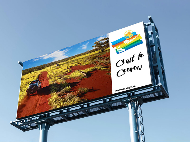
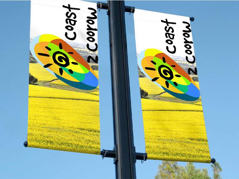
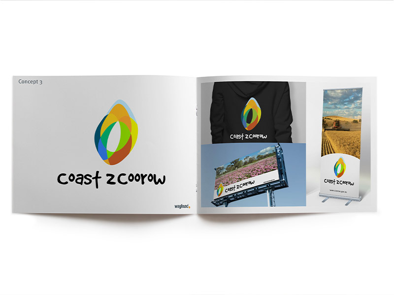
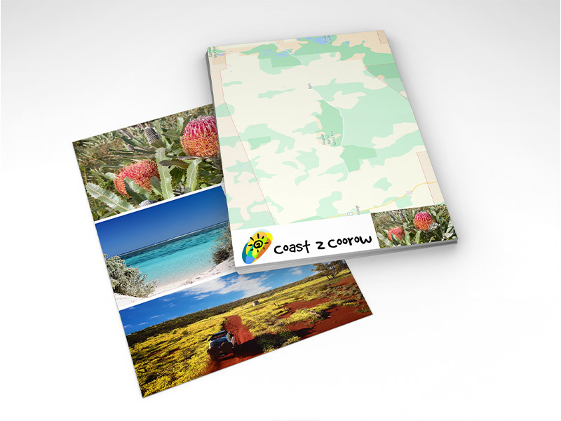
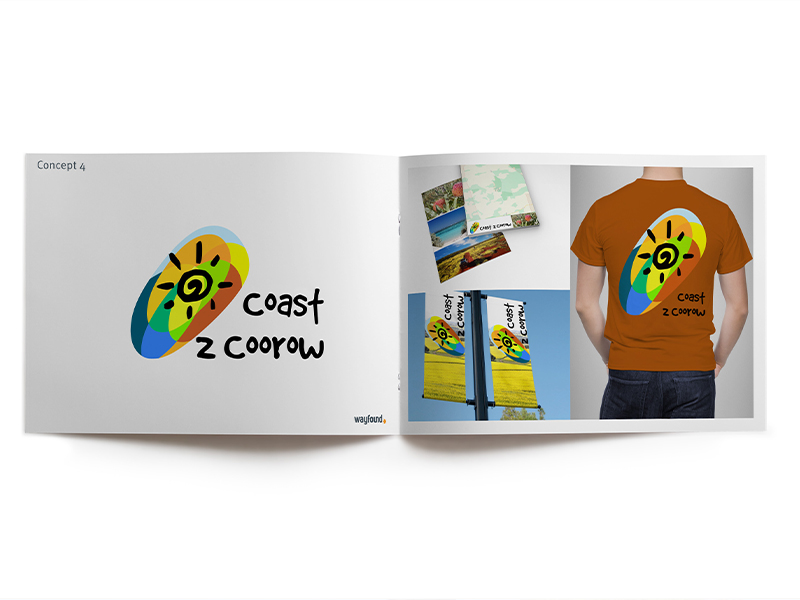
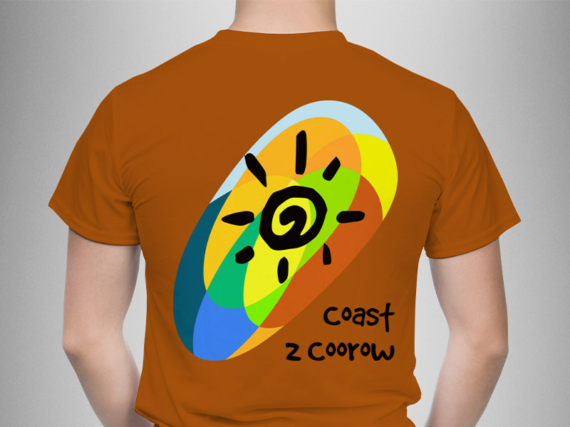
The “Coast to Coorow” destination brand is designed to become an overall marketing vehicle to promote the Shire of Coorow as tourist destination. This brand will be used across all Shire digital and printed tourist marketing material including web, social media, e-newsletters through to visitor maps, brochures, visitor information outlets and promotional billboards.
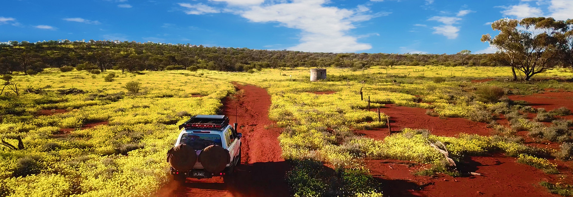
The Shire borders the Indian Ocean in the west traversing east across the coastal heathland, the grain growing wheatbelt before finishing in the red soiled range land country at the eastern edge of the shire. The goal of this project is to link the coastal region to the eastern side of the shire to encourage visitors to explore the contrasting landscapes that the Shire offers.
Look and feel
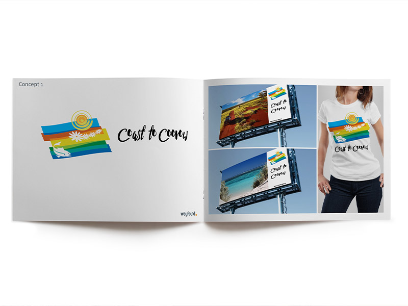
As this project is aimed at tourism we worked at creating a relaxed, carefree feel that didn’t take itself too seriously. This is projected through the hand drawn typefaces and organic shapes. We also wanted to produce a design that could be used as a “wearable” brand that could be adapted to suit merchandise materials.
The shapes
Each shape was created by forming the palette of colours symbolic with the shires contrasting countryside into an overlapping blocks and then applying a warping tool to create the fluid organic shapes that reflect the rolling landscape and the different land types and uses. The shapes are not representational of any particular feature but can be interpreted in many different ways as it is designed so that each viewer will interpret it differently.
Typefaces
For this project we chose “hand drawn” typefaces. These typefaces project a carefree informal feel and and provide a balance to the organic shapes. They also work well as headline typefaces for advertising and promotional material. These hand drawn typefaces will require some adjustment when adopted.
Colour palette
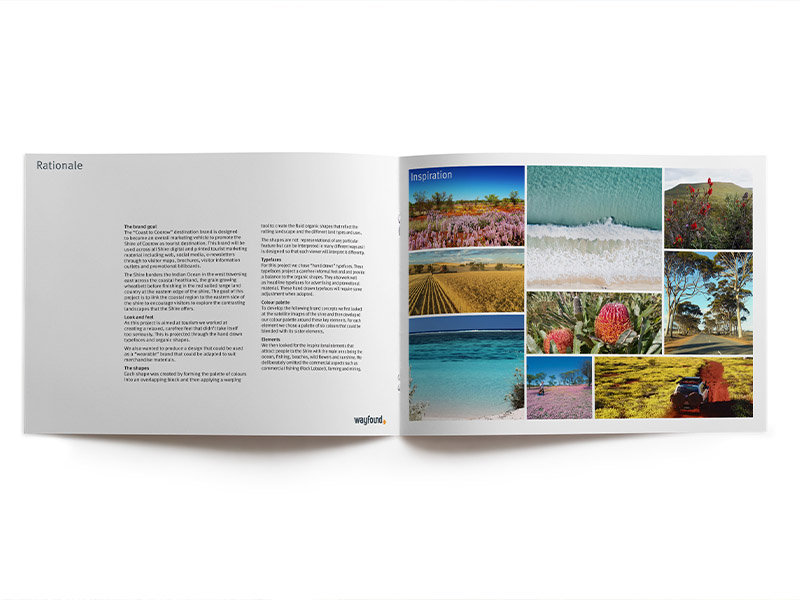
To develop the following brand concepts we first looked at the satellite images of the shire and then developed our colour palette around these key elements. For each element we chose a palette of six colours that could be blended with its sister elements.
Elements
We then looked for the inspirational elements that attract people to the Shire with the main ones being the ocean, fishing, beaches, wild flowers and sunshine. We deliberately omitted the commercial aspects such as commercial fishing (Rock Lobsters), farming and mining.