
How signage can improve ageing facilities and infrastructure
When it comes to signage strategy and wayfinding systems, we at Wayfound are always interested in reading about great projects and results in other places. So here’s a story from the Society of Environmental Graphic Designers (SEGD) that we think is worth telling.
The background
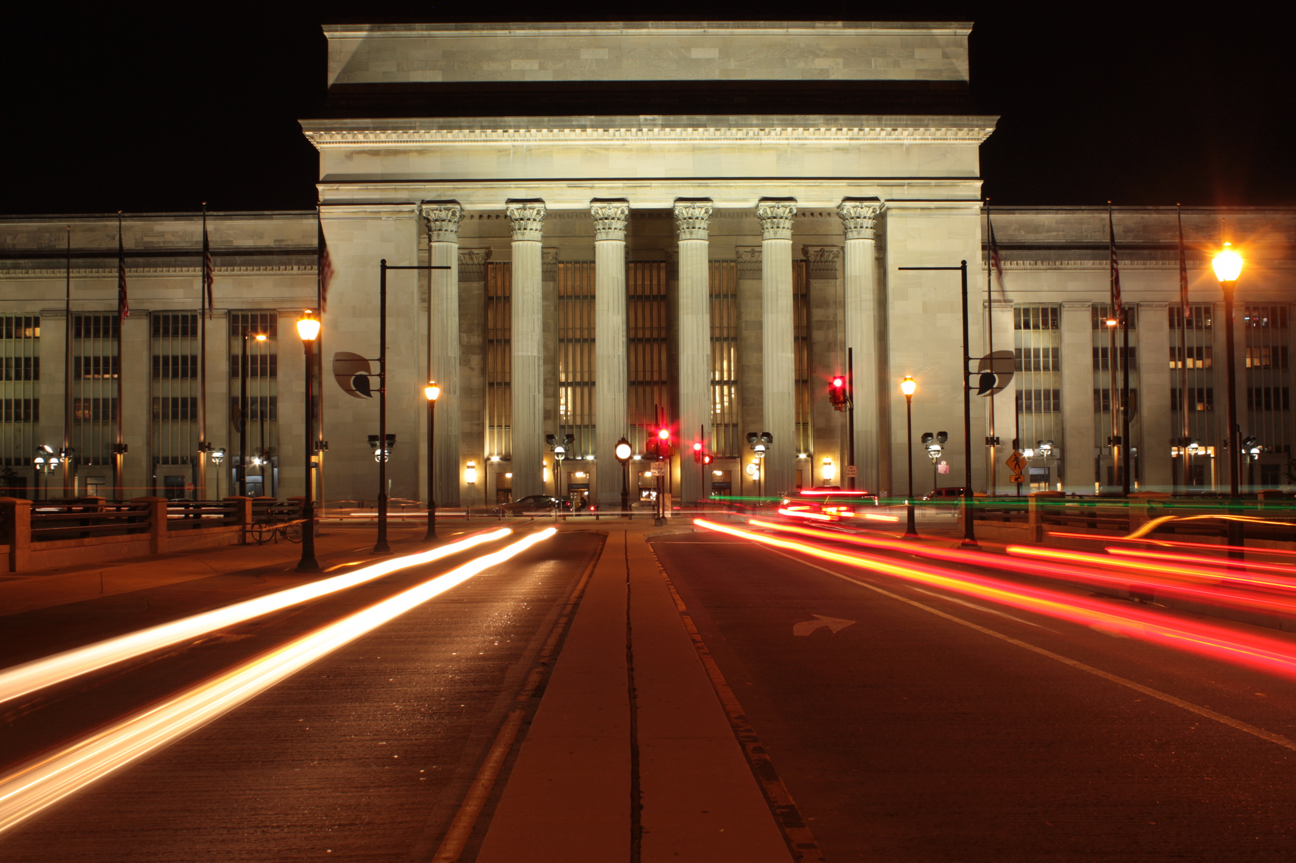
The 30th Street Station is the main railway station in in Philadelphia, Pennsylvania. Opened in 1933, it is now listed in the National Register of Historic Places, but is still one of the busiest stations in USA, with over 11 million riders a year passing through. The station is a hub for people travelling by bus, rail and subway – using both the Pennsylvania State transport services and Amtrak (the nationwide rail service).
Rail travel in the USA is expected to increase exponentially in the next few years. So, older stations, like 30th Street, had to look at their facilities and infrastructure to cope with the demand. Improving access and improve circulation in and around the building was imperative.
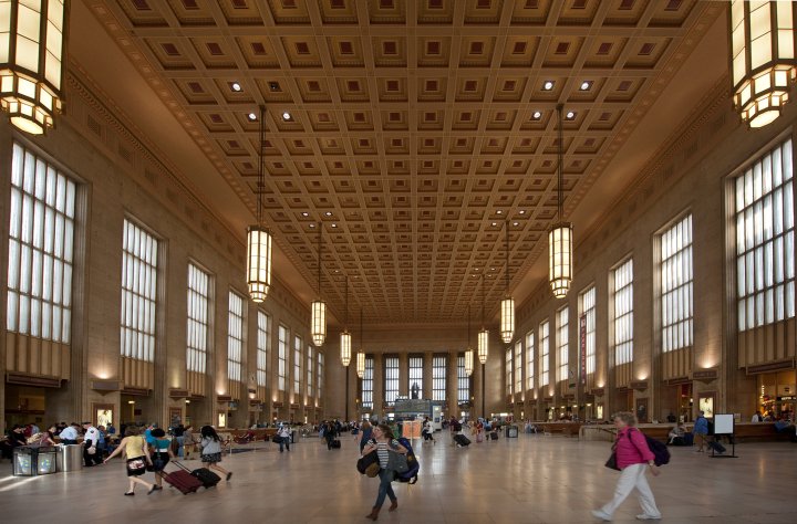
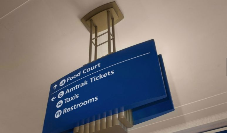
Updating the signage and wayfinding was of key importance. The previous system was first installed in the early 1980s. With ad hoc additions, it had become was a confusing mix of mismatched, obsolete and dilapidated signs. The color scheme of gold text on a red field was difficult to read, especially for people with disabilities.
The signage strategy
The strategy designers, Calori & Vanden-Eynden used to improve the signage had a number of steps.
- Improving the wayfinding and signage started with an inventory and audit of existing signage with recommendations for modifications and improvements.
- A signage master plan, which considered current and future user demands was developed – it included things like passenger flow, circulation paths, sight lines and viewing distances.
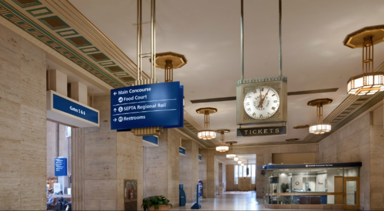
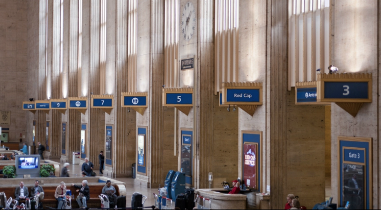
- A system of sign forms, colors and messages appropriate to the station, visually effective and subtly branded were designed.
The project had a lot of complexities because the heritage listing required modifications to be done in a sensitive and sympathetic manner while the wayfinding system needed to cater to the needs of 21st Century passengers.
The results
The new colors and typography increased readability and legibility. The addition of icons and symbols accommodates non-English speakers. Sign shapes and forms are sympathetic to the Station’s historic architecture. Functionally, new directory maps provide passengers with information about the station and the surrounding neighborhood.
A large directional near the west si de of the station is used to reinforce the north/south circulation path of riders. Its magnitude allows it to be seen by passengers arriving on the opposite end of the station.
The bigger picture of economic viability
Improving signage and wayfinding in the station is considered to have wider benefits. Not only does it improve the travel experience for rail passengers by making connections easier, it also improves productivity and efficiency, contributing to the economic viability of cities in the North East Corridor of the USA. This in turn attracts more businesses, residents and investors.